• About Me

Kevin M. Watson

Kevin M. Watson

Tag Archives: Bible Review

The Shepherd (NKJV) by Humble Lamb: Innovation and Distinctive Design in a Premium Bible

12 Thursday Jun 2025

Posted by Kevin M. Watson in Bible Review, Book Review

≈ Leave a comment

Tags

Bible Review, Book Review, Humble Lamb, NKJV, premium Bibles

It has been nearly five years since I have reviewed a Bible here. I wrote my first review of a fine Bible in May, 2018. I reviewed an NIV Schuyler Quentel. Over the next two years, I really enjoyed having the chance to review a few dozen premium leather Bibles. 

There are a handful of reasons I initially decided to write these reviews. The first and foremost is that I believe reading a physical copy of the Bible is superior to reading the Bible on a screen. You remember and retain what you read in a physical book more than a screen. But especially with the rise of smartphones, which are themselves beautifully designed and addictively enjoyable to interact with, I think there is a need for and value in Bibles that are themselves beautifully designed, a joy to hold, and designed thoughtfully for the reading experience. Fine Bibles are expensive. They are also built to be used and to last a lifetime. Simply put, I think premium Bibles are a worthy investment.

From 2018 through 2020, I reviewed Bibles by Cambridge, Crossway, Schuyler, Thomas Nelson, Trinitarian Bible Society, and Zondervan. These reviews gained the most interest and interaction from readers of about anything I’ve written, other than my “Wesley didn’t say it” series. I still get questions from people about Bibles. In fact, the most recent question from a reader was seeking advice about which NLT Bible she should purchase based on a handful of criteria. The highlight for me of those years reviewing fine Bibles was realizing that Cambridge featured my reviews in their yearly Bible catalogue. In fact, the current catalogue still has a quote from my review of the Pitt Minion (see p. 15).

I recently became aware of some significant new additions in the world of Bible publishing. This post is introducing a Bible from a publisher I did not know existed when I wrote my last post (though they officially started in 2017): Humble Lamb.

Humble Lamb currently has Bibles in four different translations: KJV, NKJV, NASB, and NLT. Each translation is a different layout. What is most interesting to me is that Humble Lamb seems to have thought through the range of options in the world of premium Bibles and intentionally created a space for themselves that is distinct but still works in the fine Bibles space. We will get into some of the differences, but they are really unique compared to any other Bible I have reviewed here. In fact, for me, they push the envelope so much that I wondered if I would like some of the choices that were made. Spoiler alert: I did!

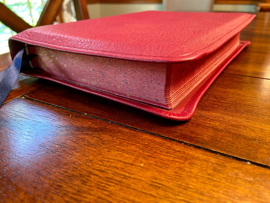
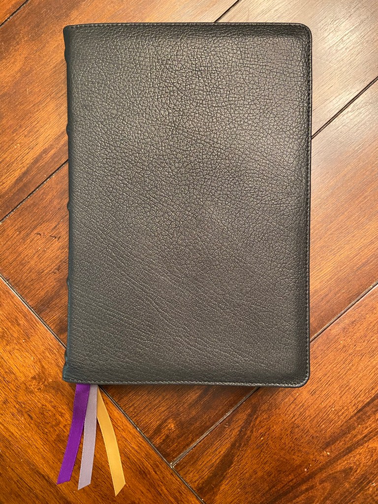
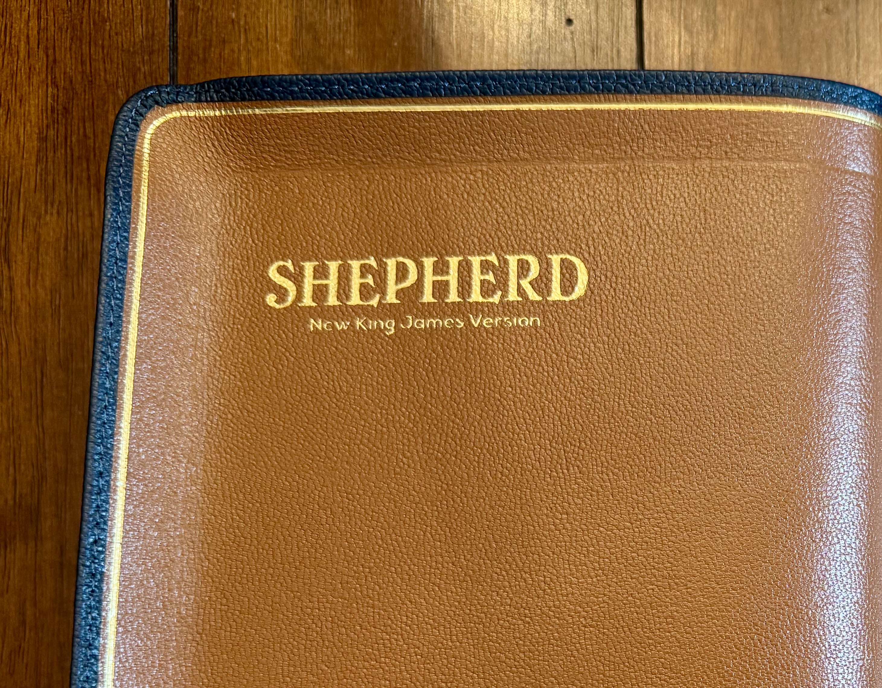
Humble Lamb sent me a review copy of their NKJV Bible, the “Shepherd”. There are size colors available in the NKJV Shepherd. Humble Lamb sent me “Sahara Blue.” 

Distinctive Design Choices

I want to start by talking about the choices Humble Lamb has made that cause their Bibles to really stand apart from the other options currently available in fine Bibles. I see five key choices that are different.

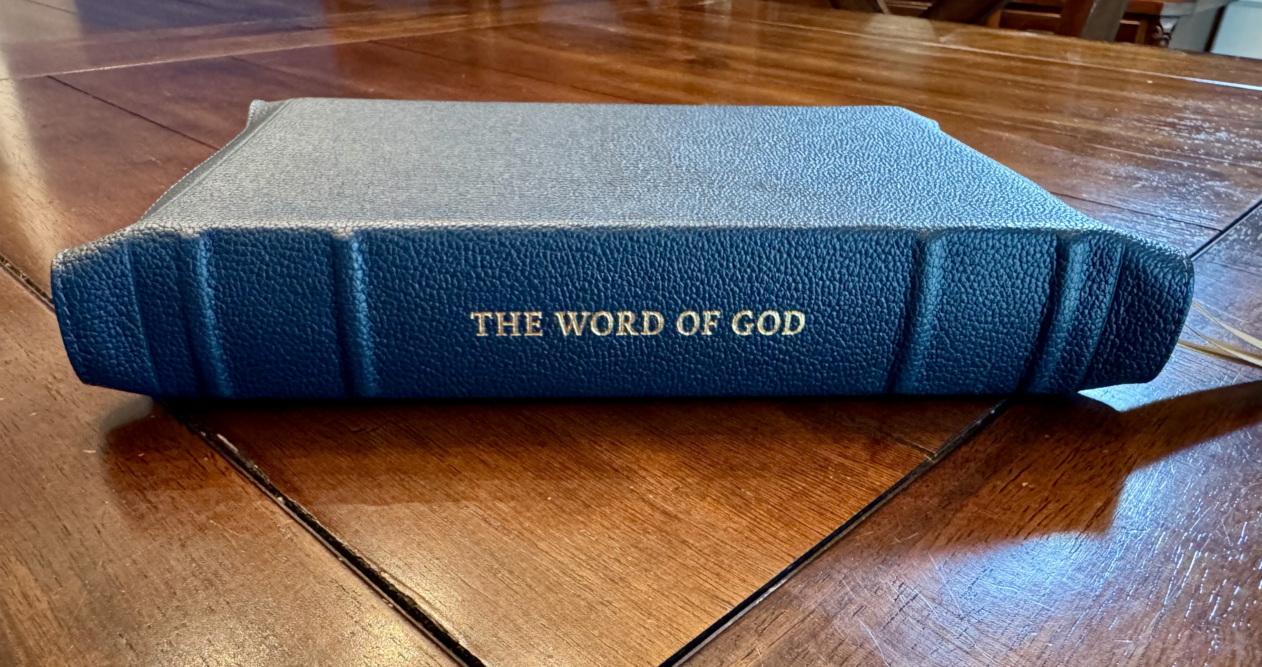
First, all Humble Lamb bibles have “The Word of God” stamped on the spine. Most premium Bibles have “Holy Bible,” the translation abbreviation, and the publisher. Humble Lamb has changed the phrase in a way that grabbed my attention and has kept it simple. It says “The Word of God” and nothing else. This is the case across all four translations. The inside cover contains the name of the Bible and translation “Shepherd, New King James Version.” I think this design decision was a good risk. I’ll say a bit more after going through the rest of the differences.

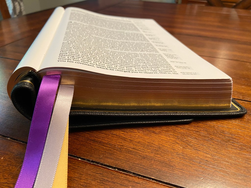
Second, most premium Bibles have gold page edges and when the Bible is opened there is a reddish color that is under the gold. I think this might be the most dramatic design change Humble Lamb has implemented. Rather than a simple subtle color change, Humble Lamb has introduced art on the fore-edge of the Bible. It is visible when the Bible is closed but subtle and would be easy to miss. But when the Bible is open, it is unmistakable and striking. The Shepherd has two different options for the fore-edge gilt art. Mine has Jesus holding a lamb surrounding by wolves. It is a great image of Jesus’s promises in John 10. I can easily imagine this seeming cheap or gimmicky. But Humble Lamb has pulled it off. After using this Bible every morning for more than a month, this Bible would seem strange to me if it did not have this element. 

Third, Humble Lamb has added Gustave Doré illustrations throughout the Bible. This is the design element I have wrestled with the most. I think it works with the overall flow of the Bible. The art on the page edges makes the art inside the Bible make more sense. I am still undecided about whether I would choose to have this element, if I could have the same Bible with the images or without the images. The inclusion of the illustrations makes it start to feel like a Study Bible, without any of the other features of a Study Bible. I was a bit surprised there wasn’t more context or explanation for the illustrations in the Bible itself. If I had to guess, where I am unsure on this element, I bet many more people are enthusiastic about this addition. There is one other tradeoff I kept thinking about I’ll come back to in a moment.

Fourth, the words of Christ are blue in this Bible. (They are typically red, if they are set off from the regular text.) There are different views about whether the words of Christ should be in a different color than the rest of Scripture. I think the choice to use blue instead of red for this Bible totally works. It is the kind of change that feels dramatic, because I’d only ever seen red. However, it is not actually that big of a change. I think it is a brilliant move that makes the Bible really feel different from other Bibles.

Fifth, and finally, Humble Lamb Bibles have more color options for the cover than most Bible publishers. The Shepherd comes in six colors. I have one of the two most conservative colors “Sahara Blue.” The other is “Black Wool.” “Forest Green” looks like a good option is you want a Bible that is distinct from the typical black, brown, or blue, but aren’t ready to be too crazy in your color choice. And then there are the options of “London Red,” “Coral Coastline,” and “Aspen Gold.” I do not think I would like the brighter colors for a premium Bible. It would feel like a substantial risk to me at this price point. But what do I know? It looks to me like other publishers have been influenced by Humble Lamb as many of them seem to be offering more color options.

 Overall thoughts on the distinctive design of the The Shepherd

I think these five distinctive design elements generally work very well together. If Humble Lamb had been risk averse and had just chosen one, I don’t think it would work. If you took any of the first four things named above by itself, I don’t think it would work. I think what Humble Lamb has done so well is figure out what the principles of a premium Bible are and keep them solidly in place, while being willing to innovate and change multiple things around that. The overall feel is that this is a unique Bible that still feels like an exceptional premium Bible.

The Rest

The Cover

The cover is full-grain goatskin leather. It is a true full yapp cover. The spine has four bands, which I love.  I also really like the Sahara blue color. It is not too bright or too dull. The blue looks great with the gold “The Word of God” on the spine and with the three copper ribbons. The ribbons also come out of the box at the perfect length, neither too short nor too long. 

Layout

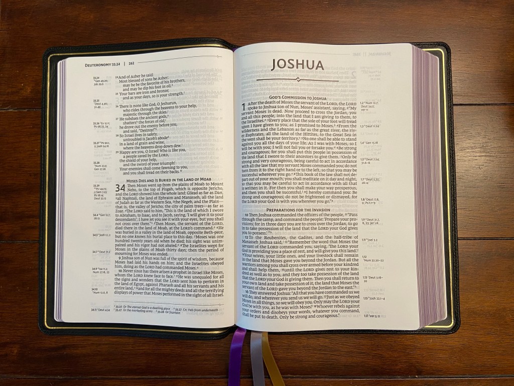
The Shepherd has a single column layout. This is a must for some people. It is not for me. But I do think it made it reading this Bible more enjoyable. I was initially surprised to see a Bible of this size only have a 9pt font. The space between lines and the overall layout do make it highly readable. It feels like a bigger font than 9pt when reading it.

This Bible has cross references, which is a top priority for me in a premium Bible. They are in the margins out from the corresponding verse out at the side, which makes them the easiest to use. Textual notes are in the footer, which helps separate them from cross references.

There is one thing I wish were different about the layout. I think may be a personal quirk that is not important to everyone. I prefer each Book of the Bible to start on a new page. I mentioned a tradeoff I wrestled with when thinking about the illustrations in the Bible. If I could remove the illustrations and have each Book start on a new page, I would. Luke, for example, starts with only three lines at the bottom of the page. I don’t love that design.

Overall, I do like the design choices made with the Shepherd, with the one exception just noted. The layout is key to ease and enjoyment of use when reading. I would give this Bible top marks for ease and enjoyment of reading.
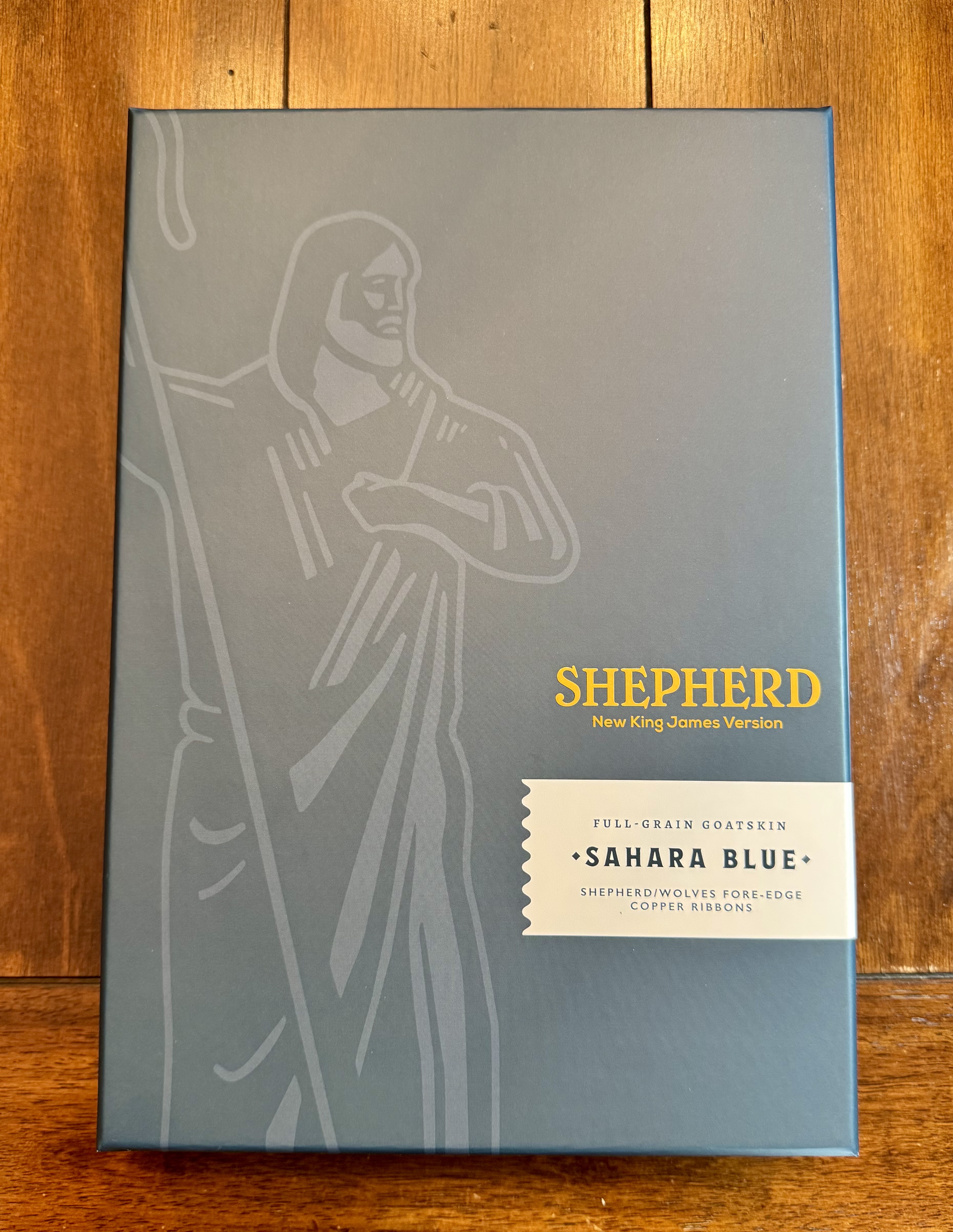
The Box

I want to name one other thing that I really like about this Bible that may seem strange to you. I really like the box this Bible came in. It is very sturdy. The color coordinates with the cover of the Bible. It does not have any extra text, so it is clean and seems more elegant or substantial to me. The presentation and experience opening the Bible was the best I’ve had with any Bible. It was obvious to me that this is a place Humble Lamb put serious thought and effort. They executed this very well. 

Conclusion

Overall, I think the Shepherd is a fantastic Bible. I have really enjoyed reading it in the mornings since I received it. And while I wanted to spend quite a bit of time reading it before writing this review, this is not a Bible I am going to put away after publishing this review. It is fun and enjoyable to read. Humble Lamb has done a fantastic job with this Bible. This Bible is exactly the kind of Bible I love recommending. As I mentioned at the beginning, with the competition of smartphones and screens for our attention, I am thankful there are Bibles like this that are a delight to hold, read, and interact with. 

I am excited to see what Humble Lamb comes up with next!

Humble Lamb generously provided the Shepherd pictured here for review. I was not required to give a positive review of this Bible, only an honest one.


Kevin M. Watson is Director of Academic Growth and Formation at Asbury Theological Seminary’s Tulsa, OK Extension Site. He is also Scholar in Residence at Asbury Church. His most recent book, Doctrine, Spirit, and Discipline describes the purpose of the Wesleyan tradition and the struggle to maintain its identity in the United States. Affiliate links, which help support my work, used in this post.

Allan NRSV Classic Reference Edition with Apocrypha: An Exceptional Binding

16 Friday Oct 2020

Posted by Kevin M. Watson in Uncategorized

≈ Leave a comment

Tags

Allan Bible, Bible Review, NRSV

If you are a fine Bible enthusiast, you know that there has been one glaring omission from the Bibles that I have reviewed so far: Allan Bibles. If you don’t know about Allan Bibles, they are perhaps the most highly regarded of all fine Bible publishers. When I asked for a review copy of an Allan Bible, I was politely told that they have been unable to meet demand for their Bibles, and so they do not give review copies. This is partially due to their size. Allan is a small outfit, especially compared to major publishers like Cambridge, Zondervan, and Crossway. But it is also because their customers rave about Allan bindings.

About a year ago, I started pinching pennies to save up to buy an Allan Bible to see for myself. When I found out that they were releasing a new NRSV with apocrypha, I decided to grab one. The first thing I discovered was that Allan Bibles do sell quickly! The only option I had was a red cover. This Allan NRSV Classic Reference Edition with Apocrypha is the subject of today’s review. (And unfortunately, due to their popularity the NRSV reviewed here is out of stock as of this writing.)

Cover

You can buy Allan Bibles in a variety of goatskin covers. Allan is especially known for their Highland goatskin covers. Highland goatskin is a natural grain, which means an artificial grain isn’t imprinted or stamped on it. I had seen so many people rave about Highland goatskin – the goatskin of all goatskins! – that if I was going to shell out for an Allan Bible, it had to be in a Highland goatskin cover.

Allan is also known for the yapp on their covers. Yapp means that the cover extends well past the pages. A full yapp cover basically completely covers the entire text block (the pages of the Bible). A semi-yapp cover folds partially over the pages. 

The Allan NRSV Classic Reference Edition with Apocrypha is bound in a red semi-yapp Highland goatskin cover. The binding is edge-lined. The text on the spine is simple and nicely done. I like this cover. The Highland goatskin feels natural in a good way. It is a bit rougher than other goatskin covers. I assume this is because it has gone through less treatment than many other covers. Some goatskin covers feel plush, and this does not. Out of the box, it has the ideal rich leather smell you hope for when you buy something that is real leather. I also think this cover will break in really well. I expect this Bible to only get better with age and use. And that, of course, is the point in buying an exceptional Bible that is made to last.

The best part about this Bible is how flexible the binding is. The spine curls inward as you open the book, which lets it easily lay flat at any page in the book. You can also easily wrap the cover around the back of the Bible, one of my admittedly quirky criteria for an exceptionally bound Bible.

The reason to Allan Bibles are so popular is because of the exceptional quality materials they use in their covers and the extraordinary craftsmanship in the binding itself. I have other Bibles with great covers that are exceptionally bound, but none that are better than this one.

Layout

Here is where I must admit some disappointment with this Bible. Allan’s process is different than the other Bibles I have reviewed here. They take a text block (the actual pages of the Bible) from another publisher and bind those pages with an amazing cover. For me, this means the text itself is a bit of a disappointment. The ideal fine Bible is one with an exceptional cover that matches the quality of the ink and pages in a layout that is enjoyable to read. 

The text block for this Bible was done by the Society for Promoting Christian Knowledge. The text is acceptable. But it isn’t great. For the price, I was hoping to be wowed by every aspect of this Bible. The layout is a standard double-column layout with references in a center column. I cannot find the font size, but it seems a bit smaller than I would expect for this size Bible.

Other Features

The ribbons in this Bible are a rich blue that was a brilliant choice. They go great with the red cover. (Allan Bibles have a reputation for coming with really long ribbons, and these are very long!) 

This Bible includes the Apocrypha, which some people will love and others might not like. It is a nice research tool because the Apocrypha also includes cross references to other passages in the Bible. In my review of Zondervan’s NRSV single-column reference Bible, I lamented that it seems to be standard in NRSV editions to restart pagination in each testament (and celebrated that the Zondervan edition does not do this). The Allan NRSV restarts pagination in the Apocrypha (which is between the Old and New Testaments) and again in the New Testament.

This Bible does not have the glossary that is found in most NRSV reference editions. I am not sure if it was not included in the SPCK edition or if Allan left it out for a slightly thinner profile. Most readers won’t mind this omission, but it does somewhat limit the Bible’s appeal as a reference edition. (Particularly when a Bible as small as Cambridge’s NIV Pitt Minion includes a 2,474 word concordance with more than 10,000 Scripture references.)

When I first heard about the Allan NRSV Classic Reference Edition with Apocrypha, I remember much of the buzz was over the antique marbled page edges. I was skeptical about whether I would like these and would have definitely chosen art-gilt page edges if I had a choice. When the Bible arrived, the marbled page edges were a disappointment to me. I wonder if they work better with different color covers. The speckled pages give me the feeling of trying too hard to make the Bible seem older than it is and to me it ends up coming across as contrived. But this, of course, is purely subjective. I know some people love the risk Allan took and think it paid off.

Finally, the Bible comes with maps and a generous amount of lined paper at the end of the text block. The lined paper is a another well-known and much beloved feature of Allan Bibles.

Conclusion

Allan bindings live up to the hype. I don’t think you can improve on the quality of the binding. It is truly exceptional. While I am very glad to have gotten my hands on an Allan Bible, I don’t think I would buy this Bible again. To me, the quality of the paper does not live up to the quality of the cover and the binding. And I just don’t like the marbled page edges, particularly knowing that it means the Bible doesn’t have Allan’s celebrated dark art-gilt page edges. Having said that, I know a handful of people who bought this Bible and all of them rave about it.

My sense is that Allan did not have ideal options for an NRSV text block for this edition. I would love to see an Allan binding in an edition that has better quality paper. From other reviews I’ve read online, my sense is that you would find the complete package in one of their ESV or KJV editions.


Kevin M. Watson is a professor at Candler School of Theology, Emory University. He teaches, writes, and preaches to empower community, discipleship, and stewardship of our heritage. Click here to get future posts emailed to you.

Zondervan NRSV Single-Column Reference Bible, Premier Collection: Brand New! [Review]

02 Friday Oct 2020

Posted by Kevin M. Watson in Uncategorized

≈ 1 Comment

Tags

Bible Review, NRSV

Over the past few years, I have noted more than once that the NRSV is one of the least supported translations as far as bindings and formats, particularly premium bindings. That seems to be changing, which is good news for NRSV enthusiasts. The first big step was when Cambridge published a reference edition available in a cowhide binding (reviewed here) and a burgundy goatskin binding, with apocrypha (review of this one coming soon). Both of these Bibles were very well received. Retailing at $320 and $350, respectively, they were also simply too expensive for many people. After the Cambridge NRSV reference edition, Allan released a reference edition, with apocrypha (review of this one coming soon). The success of both of these editions seems to have convinced publishers that the NRSV has a big enough audience that it can support a broader array of options and bindings.

The latest arrival in this growing trend is Zondervan’s NRSV Single-Column Reference Bible, Premier Collection. This Bible is the subject of today’s review. And it is is hot off the press, having been released on September 22, 2020. 

Cover

This Bible comes in a black goatskin edge-lined binding. The goatskin is my favorite leather cover I have seen on a Zondervan or Thomas Nelson Premier Collection Bible, though the NKJV Single-Column Reference Bible I reviewed here is a close second.

The cover feels thick and substantial. The grain strikes a pleasing balance between the smoothest and pebbliest covers I’ve seen. The bands on the spine give the Bible a more substantial and sophisticated feel. I really like the minimal use of text on the spine. There is lots of blank space, while conveying the necessary information.

There is one thing I did not like about the cover out of the box: When I opened the Bible there was a very strong chemical smell. I suspect one of the last things done to this Bible was treating the cover with some kind of polish. It seems to have been done somewhat unevenly. I am not overly concerned about this as I’m pretty confident the smell will go away in time. It does make an unfortunate first impression. If you buy a fine leather Bible, it should smell like leather out of the box, not chemicals.

Layout

As the title reveals, this Bible is a single-column layout with cross references. Zondervan describes this Bible as offering “the ideal combination of readability and elegance. The thick, opaque paper and line-matched single-column layout is now paired with Zondervan’s exclusive NRSV Comfort Print typeface to bring the words into clear focus.”

I like this layout. The references are on the far outside of each page. Textual notes are in the footer. The print quality on this Bible is consistent and very good. The ink seems darker than most Bibles I’ve seen, which helps with readability and show-through. While there is quite a bit of show-through, I have not found it to be distracting. It could be better, but for me it is acceptable. 

Other Features

One of my pet peeves about many NRSV editions is that they paginate the Old and New Testaments separately. I don’t know if this is distinctive of the NRSV, but I disliked it more than I expected in the Cambridge reference edition I reviewed two years ago. (It still bothers me, despite that Bible being one of my all-time favorites.) One of the first things I checked in this Bible was pagination. And Zondervan did not restart page numbering in the New Testament! Well done.

Why do I care about this? I think restarting pagination in the New Testament communicates separation and disconnectedness within the canon of Scripture. The Bible is one book, not two. I am sure there were good reasons for why the NRSV often does this, but it is not a choice I would make. I think Christians need to be taught the importance and significance of the Old Testament and its value for Christians today in every way possible.

I dislike the use of Hebrew Bible or Hebrew Scriptures in reference to the Old Testament for the same reason. For Christians, the Old and New Testaments together are Christian Scripture. Whereas NRSV editions often introduce the Old Testament with “The Hebrew Scriptures commonly called the Old Testament,” Zondervan simply has “The Old Testament” on the page before Genesis. This is another small detail I appreciate.

Zondervan made some surprising choices in the design of this Bible. And I love them! First, the Bible has purple-under-gold art-gilt page edges. This means that if you look at the end of the pages when the Bible is closed the pages look gold (mostly) and if you look at the page edges with the pages opened, the end of the pages look purple. Red-under gold has long been the standard. Zondervan used blue-under-silver in their early NIV Premier Collection and that risk worked well. This one does too. That design choice is nicely complemented with purple, silver, and yellow ribbons. 

Conclusion

I am always grateful to see publishers investing resources in Bibles that are thoughtfully designed, made with materials that are designed to last after thousands of hours of use, and are a pleasure to handle and read.

Zondervan and Thomas Nelson’s entry into premium Bibles has been especially welcomed. I think they have actually succeeded in creating a new category. These Bibles are not quite the same quality as a Schuyler, Allan, or Cambridge Bible. But they are close. And they are typically significantly more affordable. This Bible is available for $170.83 on Amazon.com as of this writing. That is more than $60 and $90 less than the two Cambridge Bibles I previously mentioned. There is a lot of room between the finest and most expensive Bibles and everything else. I am delighted that Zondervan has taken a step in bridging that gap by making exceptional Bibles available to more people.

For preachers in particular, if the NRSV is the version you preach from, I think this would make for a great preaching Bible. The size is very comparable to other preaching Bibles I have seen. And the 10.5 point font will be large enough for most people to comfortably read in the pulpit. 


Kevin M. Watson is a professor at Candler School of Theology, Emory University. He teaches, writes, and preaches to empower community, discipleship, and stewardship of our heritage. Click here to get future posts emailed to you. Schuyler generously provided a copy of this Bible in exchange for my honest review. Affiliate links used in this post.

Blog at WordPress.com.

  • Subscribe Subscribed
    • Kevin M. Watson
    • Join 369 other subscribers
    • Already have a WordPress.com account? Log in now.
    • Kevin M. Watson
    • Subscribe Subscribed
    • Sign up
    • Log in
    • Report this content
    • View site in Reader
    • Manage subscriptions
    • Collapse this bar
 

Loading Comments...